Journal 1 - Brainstorming
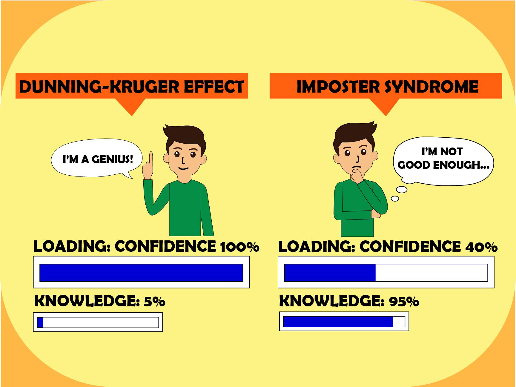
When I first started thinking about this project, I wanted to understand the difference between Imposter Syndrome and the Dunning-Kruger Effect. Imposter Syndrome is when someone doubts their abilities even though they are capable, meanwhile Dunning-Kruger Effect is when someone overestimates their abilities or knowledge. I started brainstorming visual ways to represent these opposite ideas.
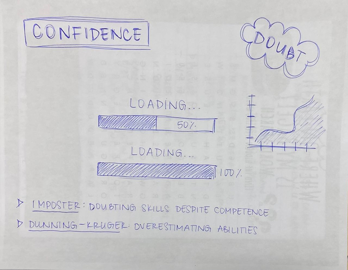
One concept I thought about was using a progress bar or loading screen to show knowledge versus confidence. For example, someone experiencing Imposter Syndrome might have a lot of knowledge but feel like their progress bar is only halfway filled up. On the other hand, someone experiencing Dunning-Kruger Effect might believe they are all 100% even though they are just at the beginning. I also wrote down ideas like graphs, mirrors, or split-screen visuals to show the contrast between the two mindsets.
Journal 2 - Research and Inspiration
I spent time researching the psychology behind Imposter Syndrome and Dunning-Kruger Effect. I learned that Imposter Syndrome is common amongst high-achieving individuals who feel like they do not deserve their success. In contrast, the Dunning-Kruger Effect often occurs when people with little experience believe they are much more knowledgeable than they actually are.
While doing research, I looked at diagrams that show the confidence vs competence curve. One common graph starts with high confidence but then drops sharply as people realize how much they do not know. The graph eventually rises again as they gain real knowledge. Seeing the visual graph helped me think about how I could translate the concept into a graphic design project.
Journal 3 - Sketching
After researching both topics, I started sketching possible layouts for my design. One sketch used a line graph showing confidence levels over time. Another concept focused on the loading bar idea where knowledge fills slowly while confidence appears to fill quickly.
While sketching, I realized that the loading bar might be easier for viewers to understand quickly because most people are familiar with the visual. I experimented with placing two loading bars next to one another… One representing Imposter Syndrome and the other represents Dunning-Kruger Effect. I also started to think about typography and whether to put labels or short phrases to which might help clarify the concept.
Journal 4 - Experimenting with Design
I began experimenting with creating the design digitally (Adobe Illustrator). I tried different color combinations as well as layouts to see what could make the concept clearer. At first, the design looked too complicated and overwhelming because I was trying to put too many elements such as icons, text, and graphs.
After reviewing the drafts, I decided to simplify the design and focus mainly on the progress bar or loading screen metaphor. I tested different progress percentages and labels to represent how confidence and competence can be misaligned. Simplifying the design made the concept much easier to understand visually.
Journal 5 - Reflection
Looking back on my creative process, the most helpful step was researching the psychology behind and finding visual metaphors that could possibly communicate them clearly. The progress bar or loading screen idea became the strongest visual concept because it represents progress and perception in a simple way.
One challenge I had faced was trying to show both ideas without making the design confusing. But through experimentation, I realized that simplifying the layout and just focusing on one strong aspect helped me improve the overall clarity. This project helped me think more about how design can communicate complex psychological ideas in a visual form.